Making a Good First Impression in 6 Seconds: Is Your Resume Up to It?
 Publié le 8 February 2017
Life isn’t easy for your resume once it leaves your outbox: far from the comfort and calm of your personal files, it is cast adrift in a maelstrom of hundreds if not thousands of other documents, all red in tooth and claw in the struggle for the same posting!
Once past these obstacles, it has but a few scant seconds to impress the reader or be tossed, lifeless, on a pile of other rejected ephemera. One. Two. Three. Four. Five. Six. Fate strikes: your chance at this dream job may be gone forever!
Clearly, this raises a vital question: how can you make a good first impression in these momentous 6 seconds?
1. Know Your Audience
Using a standard, ‘one-size-fits-all’ document is inefficient and outdated. The best approach is to tailor your resume to the job you want to apply on. You have an objective: align the description of your skills and experience with it.
This is strategic thinking at its best: you need to think about the kind of job you want. All this is crystal-clear for some, not so much for others. However, it is essential in moving to the next steps of your job search. Understanding your audience is the best way to clarify your message. If your goal isn’t clear for you, it’s not going to be clear for whoever reads your resume.
Consider making different versions of your resume according to the paths you’d like to take. You might change those features of your resume listed below without altering a single word of the description of your professional experience. Once you’re done, you’ll have the option of sending version A or B of your resume depending on how it best fits the job you’re applying on.
2. Jazz up the Look
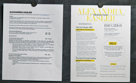
A vast majority of resumes are designed according to standards that go way, way back. Some have the lackluster appeal of old sneakers. It’s definitely worth your while to pimp up the layout and the presentation of your resume to make it professional, fresh and contemporary. Nostalgia for obsolete design has no place here.
Without even altering the contents of your document, you can spruce it up by doing the following:
1. Upload the contents to a more modern resume.
2. Avoid fonts such as Times New Roman: go for modern-looking ones such as Calibri.
3. Avoid old, over-used bullets such as these: .
4. Insert hyperlinks, including one to your LinkedIn page.
5. Add a touch of colour, especially in your name.
Apply the idea of personal marketing: your resume should show who you are both in what it says and how it looks.
3. Use a Catchy Sub-Heading
To get past the initial glance, advertise yourself proudly! A well-chosen sub-heading sends a powerful message in those crucial first seconds. It can act as theme for the rest of the document and call attention to what comes next. Depending on the job you’re looking for, you might adjust it to pique the reader’s curiosity.
Here are some examples:
- Representative – Pharmaceutical Industry
- Result-Oriented Team Leader
- Trustworthy Financial Advisor
- Business Leader – International Market
4. Highlight Relevant Keywords
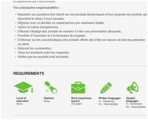
Don’t forget that no human eye may initially read your resume. Many employers use software to filter the resumes they receive and sort out the ones that best align with the vacancy they’re aiming to fill.
A simple and efficient way to work around this potential hurdle is to research the type of job you’ve got your little heart set on. Such descriptions are a goldmine to inspire you and find the right angle, especially when it comes to using the correct terminology. Focus on those skills that are most prized by employers!
In other words, if you’re applying on, say, a job as a project manager, your resume should present you as such. Your interest lies in sales? Then your resume should reflect that. Don’t let the reader decide who your resume describes. Make that call and sell yourself accordingly!
by Jessica Gohier


